Designing CourtListener
Over the past week, I've been working to create scrapers for each of the 13 federal appeals courts. Last night I finally finished the last of them, so today I'm moving on to the design of the site. Design is always much better when people work in a team, so I'm putting these designs here so others can look at them and give me feedback. Please, please do!
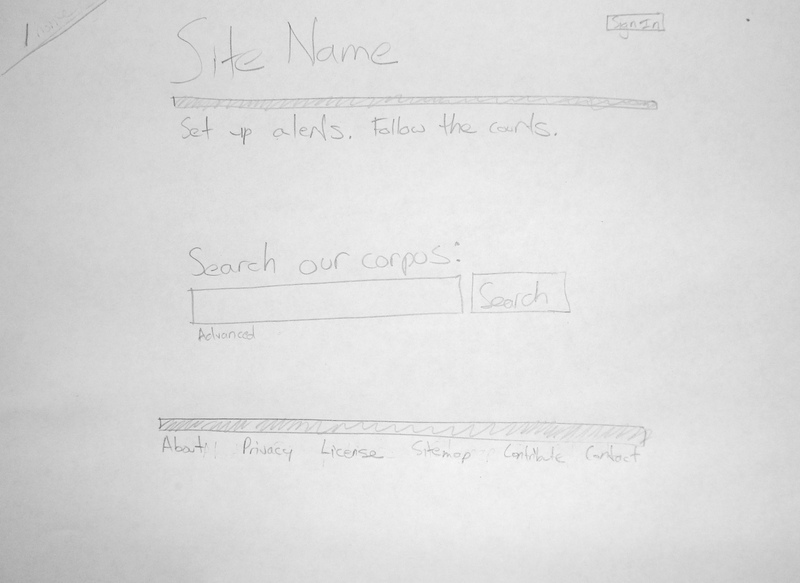
So far, I've sketched out four of the major pages that the site will have. A user's will begin using the site on its homepage. Here, they will be given few options. Basically, they can login, register for an account, make a search, or read one of the ancillary pages such as the "About" or "Privacy" page:

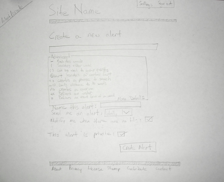
Also, note the advanced button under the search field. When this is clicked, it expands to show the advanced search queries that the site will support, as you can see on the next page.
If people are logged in, their homepage becomes the "Create new alert page," which you can see below. For now, this allows users to create very complicated queries by hand. In the future, it would be nice to build their queries for them. By default, the advanced section will be collapsed, but in the wire frame, I sketched it out. Also, if users click on "More details," (in the bottom-right of the "Advanced" box) they can get explanations and examples of all the connectors shown.

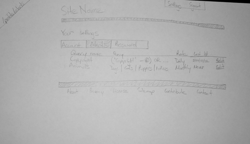
From that page, they would normally be redirected to their settings page, where their alerts are listed. Here, they can edit and see their alerts.

Clicking the "Edit" button takes a user back to the "create alert" page, except that it will be pre-filled with the alert they're trying to edit.
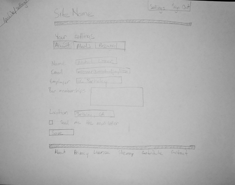
Of course, users can also edit their profile by clicking on the settings link on the top of every page . This page isn't too special, though it does have a couple unusual features, such as the bar memberships the user is a part of and whether they prefer HTML or plain text emails (not shown in the below version - sorry).

And that's it for now. I'd LOVE any feedback anybody has on these. Typing this up, I've already come across a couple problems:
- Users currently get to their alerts by clicking settings - that ain't intuitive.
- The about page is pretty hard to find. It may need more emphasis.
I'm sure there are more problems I'm not seeing. That's why I need your help. What am I missing? What should I change? What's stupid? What's outmoded?